Tuesday, January 12, 2010
Hand Painted Text (Devo: day 9)
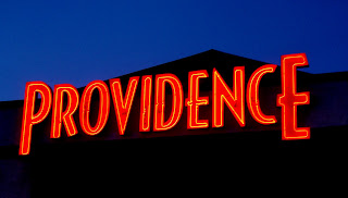
Have u ever noticed how much hand painted text there is in Cedar.
While looking around, I cam across the two above, sorry one picture I was still driving when I took the picture. I don't remember seeing hand painted text in San Diego, any time other then Christmas time. I am not a big fan of it, it seems small town to me. I would rather see a nice vinyl sign up instead, especially in a car dealership, that sells 20K - 60K cars... I don't want it to feel like a used car dealership.
Devo
A Kid From Cedar City : V
Ok, first off I don't think that anyone really reads these post. I mean I could be like blah blah blah yakkiddy smack smack blah blah blah. I bet I can even insult people and no one would even know! ....*sighs to himself* Oh well... Anyways I am putting up this post to show where I went o High School. I really don't have to much to say about it because I really didn't like my High School and there is way to many stories that I have of this school. The crazy thing is that one of the pictures shows a stone that has 2000 written on it. I remember when that put that stone up and behind that stone is a time capsule. Man I am old. Anyways...Blah blah blah red turtles and blue. I see you, you see me, blah blah blah blah blah blah blah blah blah blah blah and some more blah.
day 9
still thinking about type + environment + aura + context.
i found this a little while ago, and it reminds me of the trail markers you will come across in national and state parks to help hikers find their way. again it is created to define, understand, and label.. but is still a part of the environment and will eventually find its way back to such.
day 9..i think
I live on the north side of cedar near the shops and warehouses and random abandon ranches. For whatever reason I really like the look of big machinery so I went to play around for awhile. I don't really know what else I have to say about this picture, but I think the most important part of the last few posts has been to improve with photoshop and keep exploring ideas. I have a few more ideas for panels, which is the ultimate goal I suppose. I'm excited to have some time this weekend to really play around with textures and images and the typophoto idea that Jay has been teaching us about. Thats all folks!! Have a good one.
gasoline recession
Day 9: Jade Gelskey
Day 9: KFC
Day 9: So for this post we are going to look at another one from KFC. It is interesting to me because KFC is really trying to push this healthier chicken option. I appreciate this and think that they are doing better then most places but it still falls a little short. While 395 calories seems pretty good for a meal, and well...for fast food it really is pretty good. But for a regular meal this still is not that good. But because it mentions calories I feel like they are still bringing people in thinking that 395 calories must be good or it would not be on a sign. Just a thought...and I suppose some might be okay with 395 calories. Just not me.
When it comes to typography this sign is similar to the others. I am liking the fact that by looking at so many of these signs I really do see a pattern. A pattern that works, or they would not be using it across the board for all of the fast food signs. I think this is an interesting idea to think about. While being creative and cutting edge is really good, sometimes going what works is most beneficial when it comes to business. I think that as a designer we have to really fully understand what works and then try and be creative. Its a fine line. Get too cutting edge and it will not have the same effect on the viewers that a business may be wanting...get to boring and typical and you really are not making strides. I think this is some thing we are all faced with and is some thing that at least for me, can be worked on.
day nine: another application of neg./pos.
When brainstorming I tend to have many words running through my head, so I've been listing them in my sketchbook. As I listed words for the word negative, stencil came to mind. A stencil is the perfect 'negative'. Like in photography, the negative is the original or most perfect capturing of the image.
Also, the article Jay had us read & discuss in class had me thinking about the beauty & integrity of type & how photography contributed to "the most exact rendering of communication" (Laszlo Moholy-Nagy).
It's interesting to me that as I've been scavenging I have been capturing my findings by way of photography. I feel that it has a lost effect because you weren't there seeing what I was seeing & seeing what surrounded these findings or even getting a sense of it dimensionality. This reflects the statement made in that same article (posted below), because I feel a lost sense of physicality or tangibility in my postings.
"...[Photo]type setting preserved a technique which admittedly guaranteed the purity of the linear effect but ignored the new dimensions of life."
Day 9: The newer part of town
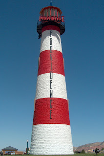
Oops another Providence piece. Sorry. I agree with Katie, the Providence area is definately a memorable part of Cedar City. The neons at the top of the light house would have been a much better picture. This picture is from the Providence gas station, not nearly as exciting. I wanted to focus on the whole area of Providence and how it is growing and becoming the new downtown. Most of the neon signs in this area seem to be brighter and have a fresh look to them. They are able to attract your attention without screaming at you saying, "look at me!" Each new building that goes in seems to be putting up bigger and better neons. Better watch out Vegas, Cedars stepping it up.
Fresh Market comes to life
Many of you may have noticed that the old Albertson's sign is gone. Today, as I drove home from classes I saw that they were putting up the new sign so I stopped to take a few pictures. It's not every day that you get to see a new sign going up on a store front and I thought it was kind of exciting to see the progress come to life. I didn't of course take pictures of every letter as it went up, but you get the idea. I went back later tonight hoping they would have it all up and lit-up with bright new fluorescent bulbs, but they weren't quite done so I took another picture of it as it is, and the sign by the street of what I assume it will look like. Perhaps tomorrow I'll take another picture of it- if they have it done.
day 8
I found this sign on the side of an old gas station in Cedar. This sign is different than most other sings. I like the fact that it is horizontal and elongated. The combination of the blue and the orange color is a good use of complementary colors. It has simple littering and it is bold and to the point much like the signs my other posts. It again has a 50's feel to it . It also uses the diagonal letter to add more interest for the viewer. I have no idea what ISO=VIS means but probably has something to do with the anti-sludge properties of the motor oil.
Shannon
Shannon
Lighthouse
Best Homework Excuse Ever!
Ok so I think that I am back in the game... meaning I think that my computer works and I think I have gotten everything squared away so I can start posting again. Anyway for those who didnt know my apartment last week had a fire and that is why I havent posted in a few days. So here is a funny photo for you all of my apartment and the best homework excuse ever! Ok on a more serious note here are some photos of what the apartment actually looked like after the fire and why I havent been at school or participating in the blog.
Well it doesnt have much to do with typography by I thought that it would look cool and it is something that has, is and will influence me in life and art and everything else probably haha.
... oh and by the way no animals nor people were hurt in the fire so dont worry about what I wrote in the wall... It was a joke haha!
Another Plate
Here's another example of metal type again. I found this example on campus again. It's on a metal plate in the middle of that monument by the centrum with the statues of historical figures. It is a lengthy quote about the glorious nature of knowledge.
I thought it was interesting that this is the only san serif font I've found on a plaque.
-Dan Gill
I thought it was interesting that this is the only san serif font I've found on a plaque.
-Dan Gill
derrick williams (day 9)
i was out taking pics and i came across this one that i can't remember when i took it but i am glad that i kept it. i liked the effect of the slow shutter speed or just that the camera i was using was cheap but i really enjoyed this picture. the word slow shown on the left and the effect of the pisture go very well.
Naturally weathered type day...something
Subscribe to:
Posts (Atom)