Saturday, January 16, 2010

Day 13 : Jade Gelskey


Day 13:

So for today I ventured all the way down to the other end of town (Walmart side) and check out what is going on in the typographic signs on fast food restaurants down there. I actually found a pretty decent sign. Aside from the flame like design I think the signs work really well. The typography is simple and strong like many of the others and the color scheme really draws your eye to what they are trying to say.

I think that this sign has a little more contemporary feel than the others I have posted up. It looks a little more like some thing people would design today. I like that they list the classic taco and then the price in a good hierarchy. I talked about how the last sign did not really work as well because this was not worked out correctly. I think this one is. 99Cents is cheap and will definitely get ones attention and the then they can see what actually is 99 cents.

Not to mention the entire time I was taking pictures the parking lot smelled like yummy Mexican food. Haven't ate at a Del Taco before but I am guessing its pretty tasty. Healthy prob. not. :)

day... 13 ..?

i can't believe i haven't thought about this before, BUT, my sophomore year here, i took intro to photography and for my final in that class i did a series of photographs about cedar city. funny thing is, being a designer, i took tons of photos of typography that i found around cedar city without really realizing what i was doing.. that was just the most interesting to me. So in reality, my project was found typography/imagery around cedar city. i am tempted to re-appropriate them into this project somehow.


day 13:


I found this building with what I call "forgotten type". You can't really read what it says. You can barely make out the word "Independent". I find it interesting that type can leave a lasting impression even when it is forgotten about when it was new, the typeface seems to have been bold san serif and probably would have been very clear to read form a distance. Now that the typeface is half gone, It is hard to tell whether it was painted on or was some sort of raised type. But now it is boring. It has lost it's meaning and seems dead. It looks like lettering from an old tombstone


sky messages!


wouldn't it be cool if there were greetings from the clouds everyday? Or if the clouds could form messages and tell you things? Cedar City would become the coolest place on earth.
I'm running out of things to say on these blogs to be honest! I'm having fun working on these panels though so we'll see. that's all for today guys sorry!

day thirteen: applying application


I've been talking about different applications of type & had mention using a stencil in a previous post. Well, here I've applied what I've been talking about.

I created a stencil to apply type to paper since I couldn't print white ink on this silver paper. In creating the final product I went through a series of creating negative & positive shapes (or positive & negative shapes, depending on how you look at it).

Mexican Anyone? (Day 13)

Checkout what I found up the canyon!

I have been experimenting a bit with some installations for another class and there is for sure some overlap with the subject matter and process of the two projects right now.

Around Campus


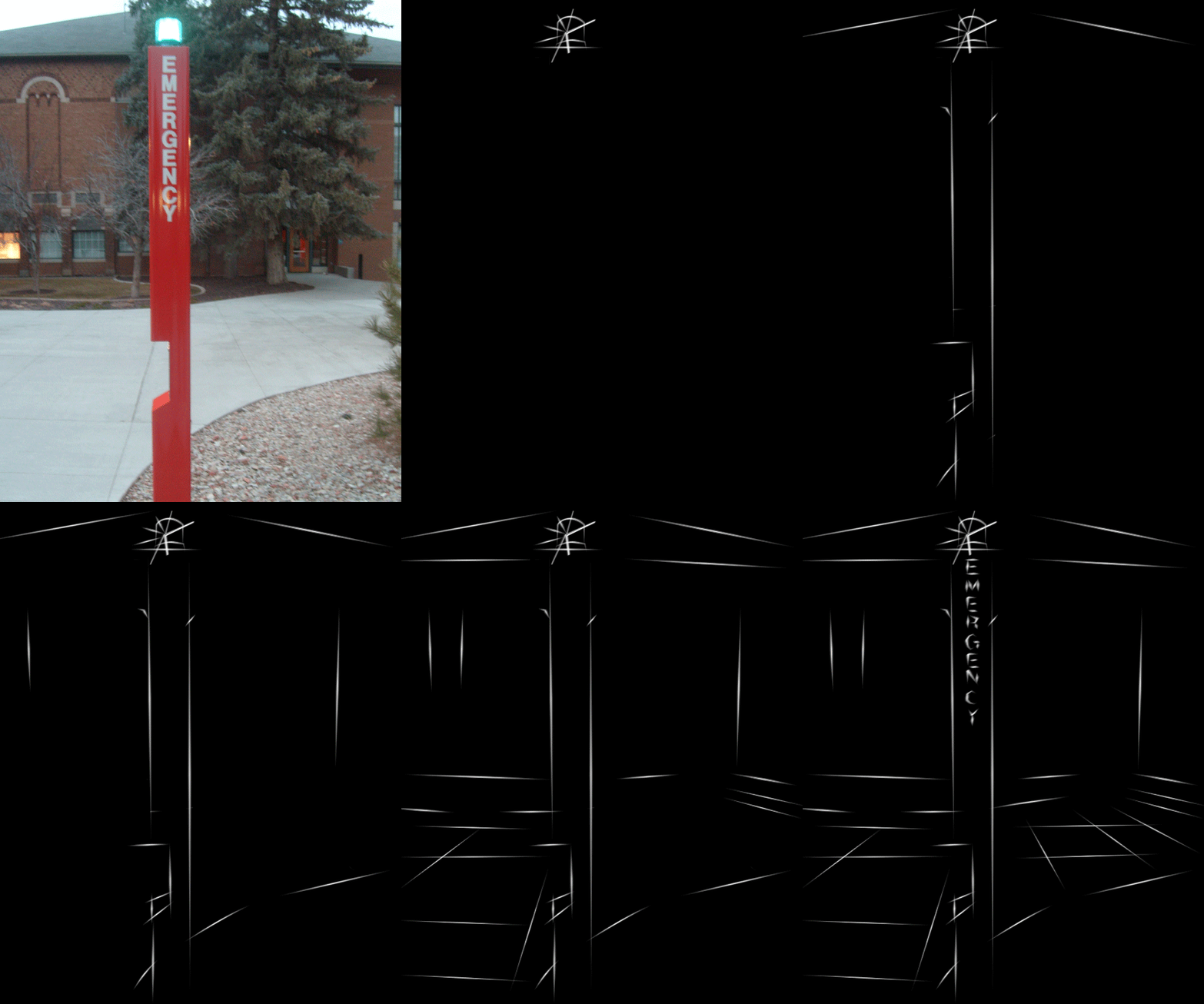
So I havent been able to post something in a few days due to technical and other difficulties so anyway I decided to do something a little more than just taking photos like I have been doing. I have been trying to focus on doing something with architecture because that is what I am going to be focusing on in my final part of this project but I was walking by this emergency call post thing and just loved the way that the text fit in it and also the sharp diagonal angles where one would press the button. Now it is pretty simple but I was experimenting with some things to do for my the final part dealing with dynamic objects, lines, or text so here is the experiment and I hope you all like!