Tuesday, January 5, 2010

day 2


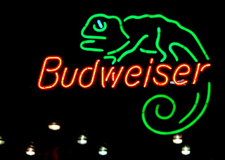
i saw this today and it cracked me up.

i began thinking about what typography is used for in cedar city. to advertise, to announce, to inform, to make a statement... but which is this? what is most typography used for in cedar city? would this change if i had any say in it? what do i use typography for? what do i want to advertise, to inform of, to announce? what statements do i have to make?

answers to these questions TBA. stay tuned

Nature's Design


I've found that anywhere I am, no matter what
I'm doing, that nature has a way of thoroughly
impressing me. I think my theme will be showing
how fantastic nature's design is through type,
emphasizing the beauty I've found in Cedar.
Nature is truly the best designer out there.

Day: Retro Posters

First off I LOVE MUSIC! What better place to find different types of fonts then a CD store? That is exactly what I did, I went to Groovacious today and HoLy CraP! They have so many different posters there that I was truly in heaven. I ask the guy if I could take pictures of the poster and he said yes. I guess my theme is places that have different types of fonts in one place. I also decided to make a quick retro band poster for my band, "Man In Brown."


No Customers


Mi Pueblo, the new mexican cuisine restaurant looks nice, but no one's there sadly. I went there today to get their takeout menu and they all stood up to serve me, but I had to leave. I'll go back someday.
I think the type setting on the outside of their restaurant makes them look more of an upper-class restaurant, than their competitors around town. Their take-out menu is a little different. Here's a picture of the front of it.

lights and letters

Well it appears some of us are thinking alike today. I hadn't checked the blog until just recently so I hope those of you who have done neon lights don't think I'm copying your idea. (Gotta figure out how to work my focus! Grrrr).
I decided to drive down main street tonight and see what signs took my interest. More specifically I was thinking of type faces and individual letters in neon signs as compared to just rectangular or square signs with lights inside or aimed at them. Sorry the images are rather blurred but I was cold and in a hurry.

Mexican Anyone? (Day 2)

It's no exaggeration, they truly are the best breakfast burritos in the world.

I really enjoy seeing signs like this, they are all over the place. I find it interesting that someone has to take the time to put up each individual letter right were they deem necessary. I love to see typographic practices like this done by the general public. How do you say kerning in spanish?

day two: negative or positive space?


I wanted to expand my white space idea & find actual letter forms created by the snow or lack of snow. Except in the latter, what I thought of as negative space before is now the positive space (the actual snow). Which defines the form?

Back to My Favorite Stuff!

So last semester I participated in a blog like this for our Branding Class and really enjoyed it! I based my last project all on different fine art graffiti like an urban artist I like. His street name is Delta and he does really cool geometric stuff like this photo below.

Anyway I just have not been able to get out of the groove of loving his work (which isn't a bad thing haha) so I decided to kind of mimic his art again but mix it with some interesting Cedar City architecture and also with some more quotes I like.

Oh the quote again comes from the book "The Traveler's Gift" by Andy Andrews. Enjoy!

Day 2

So when I was walking around campus I stumbled upon some writing in the cement.

I thought this is perfect because it follows the same theme as I had on day 1. A funny side note is that initials K.B. that were in the cement are the same initials as my older sister. I really could not believe that there was cement writings right here on SUU’s campus. It made me think of how random these places were and how wet cement writings are everywhere. People will do anything to put themselves out there. I mean none of us know what C3C and the initials means. Someone obviously thought it was important enough to put it in cement where almost every student walks by every day.

Shannon


I love looking at strange license plates and trying to figure them out. Do you these jumbled words enhance a person? Give them a feeling of ownership over the car? If you could choose any typeface you wanted, would it more accurately express you?


Well this one is pretty self explanatory.

Day 2 - The Weiser


It seems to me that most of the neon signs around town are to sell alcoholic drinks, and the majority of the signs are located in gas station windows. Hmmm... how interesting. Drinking and driving?

The History of Neon Signs
Georges Claude and Liquid Fire
By Mary Bellis, About.com Guide


"The theory behind neon sign technology dates back to 1675 before the age of technology, when the French astronomer Jean Picard observed a faint glow in a mercury barometer tube. When the tube was shaken a glow called barometric light occurred, but the case of the light(static electricity) was not understood at this time.
Even though the cause of barometric light was not yet understood, it was investigated. Later, when the principles of electricity were discovered, scientists were able to move forward the invention of many forms of lighting."

-Cami

Day 1 - The Opener


Funny story. Not too long after Type class I went home to grab my camera and start taking pictures of type, but I could not find my camera anywhere. When I finally found it, it was just about dark outside, and the only type that was really well visible were neon signs. So I decided to let the happy accident of losing my camera direct my theme. I drove around town looking for as many neon signs as I could find and was quite shocked at how many there were.
-Cami Tubbs

Model's

On my way into town, past the graffiti sign in my previous post, that many here seemed to like... I pass the above sign seen in my rear view mirror. In type 1, at UVU... we learned 32 type sins, and incorrect punctuation was one of them.

Maybe the sign is right, TLC home center has a park that possesses some super model's... But last time I checked, inanimate objects can't posses something... Maybe someone with the last name Park, has some model's to show.... I don't think so! I have a problem with this sign also.

With all these problems with type, I think my project should be using everything that's wrong with type, but make it work.... Like pulling off Papyrus with a drop shadow. Or horizontally stacking Comic Sans. I will run that one by Jay and see what he thinks.

Devo

Statue Inscription


Well in keeping with my previous entry, I've selected another example of typography that is meant to last. This time, I have taken my example from the inscription on the Old Sorrel statue.

Like the tombstone inscription in my previous entry, the typography in this example is also meant to last for a long time. The inscription tells the story of our university's founders. If you've ever read the story, it's quite apparent that it is worth writing down, especially in a manner that will preserve the legacy set forth by the schools founders.

As for the type itself, it is raised rather than carved in like the tombstone. The face of the type is gold, which makes for a nice contrast against the dark, weathered metal behind it. I've always thought that type on metal gives the inscription a strong sense of importance. There's almost a strange connection to the past and the future when one sees the inscription. I now stand and read where others have stood. No doubt, in the future, many more will stand in the same place, and read the story so carefully preserved by the typography.

-Dan Gill

Bad for Business

Would you believe it? I found exactly what I was looking for today near work. I know the tree still allows you to know what is being said, but come summer that sign will disappear until the leave fall off again. SUU might want to think about have a sandwich board out front.

the theme i chose to deal with is the "weathering" of type. Im considering black and white photography for this but so far haven't decided. I want to divide it into two sections. Artificially weathered type as well as natural. Its kinda a study on what those type styles are associated with and how delapidation can change or enhance their meaning or value. because i only have one so far i can't compare it to anything but hopefully it will emerge more clearly as we go along. I also want to retake the colored one because i don't like the light much...


Day 2: Jade Gelskey


Day 2 Image: Chicken

Day 2: Jade Gelskey
Thoughts: On my way home today from class I drove by some of Cedar's fast food places. This one I noticed at KFC and I thought it was interesting. KFC is now trying to go on a big kick of healthy grilled chicken yet this was the main sign by the drive through. I figure, if you really are trying to help people eat healthy then you should advertise the healthy food above the unhealthy. Instead the typography here intrigues the viewer to pull in and get a huge bucket of fried chicken instead of the healthier option.

cedar city festival

I was asking around my apartment what people think about when Cedar City is brought up and many things came to mind but to me i think of Cedar festivals and the Shakespeare Festival so i am going to do something with the festival or just the type of Cedar City and what different types are in cedar.