Monday, January 18, 2010

day 15

wow.. last day of posting on this here blog.

i wanted to share my experiments with typography so far....


i am trying to come up with different and interesting materials to make my statements out of. this was a friend's idea.. can you tell what it is?

day fifteen: celebration

Chocolate party for MLK day! Type created with the party refreshments for display. At first I thought someone had meant to spell MILK...because it would make sense to have milk with chocolate :)

DAY 15!!! : clean cars in Cedar?

We may not have a lot of variety when shopping for clothes in Cedar City but when it comes to cleaning cars there are endless possibilities. I counted seven different places. Its a wonder they can all stay in business. Each one has their unique style and font and is trying to beat the competition. Some of their signs make them look like the coolest place to go but on the inside they are all pretty much the same.

Walk of Fame!


I think Cedar City need stars!! Come on, a little glamor right?? I love the consistency in the stars in LA, and the clean, crisp design of the typeface on the stone. I also really like how permanent and solid the stars look..but they can install them within a matter of minutes. I think its an ironic mix of permanent and impermanent. I'd like to see the names Cedar would put down on the street, or who would pay to have an 'honorary star'. That's all I've got for today! Hooray for a final post!!

Mexican Anyone? (Day 15)

Important instructions!

day 15:


last day ! I found this building on a back road of Cedar. I find this sing to old and out dated it be form the color scheme or from the multiple fonts along the bottom of the sing. Although I do enjoy the scripted font of Antone's .The way its laid out and the over all design and the grungy look of the building do not make this sing look like the latest and greatest

In high school I had to read this book called 'Snow Falling on Cedars'. I hated it. So I used the words to create another image. More words more image? Better image, better grade? No idea.

good old grandees


I was thinking of my other favorite places in Cedar Today and I remembered Grandees. Even though it's out of business, seeing the sign brings back fond memories of going out for a double scoop after a hard day of classes even in the winter. Now I'll have to learn to love Maggie Moos, but it's not quite the same. They don't have the cool wall murals of giant ice cream, or the fun juke box, or the huge Zion ice cream challenge with its 42 scoops. Ahhh the memories.

derrick williams last post

well for the last blog i decided to go around the school and find some text but i think i already seen the university fonts and decided to take some night shots of the school....i really would like to use this image in the project and add some texts to it. the colors and lighting was great.

I'm done

This is my last post for this assignment, and I'm sure it's the same for everyone else. I used this photograph because even though this place is a perfect place to see the history of businesses in Cedar, it is still off limits to the general public. Most people will never get to experience this.

Last Post!!


Well thank God this is the last post. This statue is right behind the music building. I've walked by it many times but I never thought to read the story on it's base until today. It tells the story of a pioneer girl named Nellie. Both of her parents died on the way across the country to Utah. Then she had to have both of her feet removed with a saw and a butcher's knife because they were frozen. Later in life she married into a plural family and gave birth to six children.

Naturally, after reading this I thought, "Holy crap, she definitely earned that statue. Kudos to the pioneers."

This is Dan Gill, signing off.

Hidden

There is a game called Geocaching or something like that. As I was working at the Shakespeare Festival I cam across two of them. In side them is a history of people that also played this game.


The type does its job, weathers down, and makes way for the new, thus the cycle of a growing town like cedar city...

Day 15: Jade Gelskey


Day 15: First off....thank goodness this is the last blog post. I am so ready for this part of the project to be over, done with and gone! :)

Today I picked Carls Jr. which is at the other end of town out at one of the truck stops. Pretty random place for a Carls Jr. but I just discovered the truck stops and fast food down there. So this sign is similar to the others (which I am liking because it proves my point about a specific way to advertise to people looking at fast food restaurants to eat at. There is a specific set of guidelines many of these follow that really work to get people to buy the products they are selling.

This sign has Carls Jr.'s logo in the top but its done in a different way. The way we think of the Carls Jr logo has be re appropriated to now have the sandwich they are selling. I think this is pretty unique because it really is selling their brand. We all know the Carls Jr. logo and this re appropriation works both to tell us its Carls Jr. and to re incorporate their well known type.

Again the price is pretty large in comparison and I think this again shows how important that is to people buying fast food. It must really make a difference for a lot of people on whether or not they want to pull in to the drive through.

All in all these blog posts haven't been to bad. I think I really have learned a lot about the advertisement style that I chose and I feel like I better understand the techniques being used on the public. Very interesting since so many fast food restaurants dot the landscape.

Sunday, January 17, 2010


How about you think about the picture and decide what i might have said about it on your own. Sounds like a fabulous idea.

Welcome to Cedar City


Cedar City's Welcome sign....known as Festival City

day 14

i have finished reading 'death of the author'by roland barthes... very interesting.

the basic concept is that when a work is created, the author, the author's background, personal experiences, etc have no bearing on the work. the two are unrelated. so the context in which a work of art was created becomes unimportant to the viewer- it is irrelevant.

i think. i'm not a good explainer right now.

anyway, i am pretty sure that i have discussed this theory with my friend who is an english major (it is written in the context of literature). she and i both disagree with it.

everything about the author and their life informs their creation.

those are my initial thoughts on the subject. i will keep researching it and anyone else who has input, please share.

on an exciting note... i got them!

This is different from the modern type faces used today. More of an innocent, light, and whimsical treatment of type that fits the flavor of the faire.

Day 14: Too much?


Can you ever have too much of a good thing? I think so. This place may like neons a little too much. There are 8 small signs in the widows, the very large "Top Spot" title and the tall sign, all in neon. Yet, I still think it works somehow. Sorry about the bad quality, I took tons of pictures and none would work right.

Day 13: The Typical

So I was trying to find some neon type that was not the name of a store or resturant. This ad is one of many that you can find around town, usually at gas stations. The composition is well done on this ad.

A simpler time

Seeing this just makes me want to cry...

Wingers: The American Dinner


So sticking with the 1920's typefaces. I decided to look at different type's instead of the tradition san-serif. I kept driving by wingers going to work and for some reason i kept looking at the logo and wondering about the typeface they used. I took a picture and then looked it up. The typeface that they use here in cedar is called Metropolis and it came about in the 1920's as well. Its thin lines with certain letters are what separate it, also how compact the type face is. It took me awhile to find it because there are so many typeface's that look like it. It took forever to narrow it down but after asking other people we all agreed that it was that typeface. If you guys dont agree with it let me know and i'll start looking it up but since we have all agreed that no one really comments or even read's the blogs i'll just stick to what i came to a conclusion too.

Providence


So i was looking around town trying find more type faces that will fit the period i am looking at and after doing some more homework it was made easier to find typefaces that came about in the 1920's. The providence typeface in this sign is a good example of what the majority of typefaces looked like in the 1920's. The majority of them had no serif's and were thin and had that simple look to them. After driving by this sign it clicked and i had to take a picture of it. What i like most is that all the signs that have "providence" on them use that same kind. Which tells me that the whole providence center of town came about in that time but through out the years i has been kept up to date.

Shakespeare

I use to work for the Shakespeare Festival and was just curious of what type of fonts they used. Most of the fonts that was used was a sans serif font. Ummmm that is pretty much all I have to say about this post.

day 14:


I thought it would be fun to drive around Cedar with my dad who doesn't really know much about design and see what kind of typefaces he liked. Of all the pictures we took that day, he really likes the fresh apples sign that is in this picture. He could not really tell me why he liked this one the best. He did say that it was easy to read even though it was dirty and small. As we were looking at signs around town he said that he mostly liked the sign that had script fonts.
This sign is direct with the contrast of red ans white. I am not particularly a fan of the fresh apples sign. I think it is kind lopsided and not well put together. I thought it would be interesting to compare the perspectives on the same sign of someone who had not taken any classes in design and one who has.

Lions

Ok so this is a kinda crappy sketch but whatever. I was walking around the park and a saw the Lions club crest and it made me think how it is sort of an example of type that is meant to last and carry on a legacy. It represents the Lions international, obviously, but it also represents the club's ideals. The club has been around for some time and it's members come and go but the crest stays the same to carry on what was started many years ago.

-Dan Gill

graffiti


Day 13! Looking out a friends window, I thought it would be funny to write things across the top of people's cars. Of course most people would be really angry but it would be entertaining none the less.
I'm still really liking the idea of allowing the people of cedar city to contribute the the typographic messages around town. Most cities wouldn't support this graffiti style idea, but I think the people could really express themselves if this were allowed. In a designer's dream world all the typographic contributions would have tasteful leading and kearning, and would use classy typefaces (ie no papyrus). Maybe if this were the case, the city officials wouldn't have such a problem with it. That is the reason after all that graffiti isn't allowed right? Because it cheapens the look of buildings or objects. So what if all graffiti was well designer, conservative to some degree, and had a meaningful concept (no john smith was here).
This is obviously far fetched but I think that could fit in the parameters of the project. Something to think about at least.

Day 14: Jade Gelskey


Day 14: So today I wanted to look a little more at the Del Taco advertisement signs. So this one is another on the window like the one from yesterday. Instead of red its yellow which I think still works (although the food blends into it a little more where if it was standing out it might be better.

The text on these signs is kind of interesting. I am not sure off the top of my head which font it is, or if it created and is not a font commonly used. It does have a more festive feel which I think goes well with Mexican culture but I don't know if it fully works when examined. It almost has like a batman, superhero sort of feel. Maybe that's just me, but regardless I think it works pretty well and I doubt people are thinking "Batman" when viewing this sign.

The white text is slightly difficult to read but the hierarchy is very good on this sign. Part of me wonders if its more important to make that limited time only stand out more because I think that many people buy things when they think they will not be able to for very long. It definitely is a technique used by many companies. I also think the text in the bottom left could be tad bit bigger. I still am liking the overall look of these signs though, and I think they serve their purposes pretty dang well.

Saturday, January 16, 2010

Day 13 : Jade Gelskey


Day 13:

So for today I ventured all the way down to the other end of town (Walmart side) and check out what is going on in the typographic signs on fast food restaurants down there. I actually found a pretty decent sign. Aside from the flame like design I think the signs work really well. The typography is simple and strong like many of the others and the color scheme really draws your eye to what they are trying to say.

I think that this sign has a little more contemporary feel than the others I have posted up. It looks a little more like some thing people would design today. I like that they list the classic taco and then the price in a good hierarchy. I talked about how the last sign did not really work as well because this was not worked out correctly. I think this one is. 99Cents is cheap and will definitely get ones attention and the then they can see what actually is 99 cents.

Not to mention the entire time I was taking pictures the parking lot smelled like yummy Mexican food. Haven't ate at a Del Taco before but I am guessing its pretty tasty. Healthy prob. not. :)

day... 13 ..?

i can't believe i haven't thought about this before, BUT, my sophomore year here, i took intro to photography and for my final in that class i did a series of photographs about cedar city. funny thing is, being a designer, i took tons of photos of typography that i found around cedar city without really realizing what i was doing.. that was just the most interesting to me. So in reality, my project was found typography/imagery around cedar city. i am tempted to re-appropriate them into this project somehow.


day 13:


I found this building with what I call "forgotten type". You can't really read what it says. You can barely make out the word "Independent". I find it interesting that type can leave a lasting impression even when it is forgotten about when it was new, the typeface seems to have been bold san serif and probably would have been very clear to read form a distance. Now that the typeface is half gone, It is hard to tell whether it was painted on or was some sort of raised type. But now it is boring. It has lost it's meaning and seems dead. It looks like lettering from an old tombstone


sky messages!


wouldn't it be cool if there were greetings from the clouds everyday? Or if the clouds could form messages and tell you things? Cedar City would become the coolest place on earth.
I'm running out of things to say on these blogs to be honest! I'm having fun working on these panels though so we'll see. that's all for today guys sorry!

day thirteen: applying application


I've been talking about different applications of type & had mention using a stencil in a previous post. Well, here I've applied what I've been talking about.

I created a stencil to apply type to paper since I couldn't print white ink on this silver paper. In creating the final product I went through a series of creating negative & positive shapes (or positive & negative shapes, depending on how you look at it).

Mexican Anyone? (Day 13)

Checkout what I found up the canyon!

I have been experimenting a bit with some installations for another class and there is for sure some overlap with the subject matter and process of the two projects right now.

Around Campus


So I havent been able to post something in a few days due to technical and other difficulties so anyway I decided to do something a little more than just taking photos like I have been doing. I have been trying to focus on doing something with architecture because that is what I am going to be focusing on in my final part of this project but I was walking by this emergency call post thing and just loved the way that the text fit in it and also the sharp diagonal angles where one would press the button. Now it is pretty simple but I was experimenting with some things to do for my the final part dealing with dynamic objects, lines, or text so here is the experiment and I hope you all like!

Acupuncture anyone?


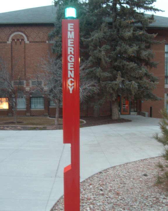
I sort of like this Acupuncture sign,(the top one). I like the logo and how it works with the text although I have no desire to be let myself be stuck by millions of sharp objects. Then I saw the bottom sign with the chunky pink text and it got me thinking about type faces and which type face would instill more trust. Would anyone go to have their appendix removed at a hospital with a font like Papyrus or Times New Roman?

From Local to International

Ok so I finally found something that's not on campus. This plaque is next to a statue of Helen Foster Snow in the park, across from Sizzler. She was born and raised in Cedar City and went on to become a very successful writer about China during the 1930s. Much of her work is now considered an authority of the state of affairs during the period.

Anyway, I love the way the gold letters look on the dark metal. You have to get up close to really appreciate it.

-Dan Gill

Full Service?

I wonder if the younger generation of drivers knows about the "Full Service/Self Service" concept. It seems to be an outdated form of filling your tank which makes it hard to find today.

day 13:

I found this building with what I call "forgotten type". You can't really ready what it says. You can barely make out the word "Independent". I find it interesting that type can leave a lasting impression even when it is forgotten about. When it was new, this typeface seems to have been bold san serif and probably would have been very easy to read form a distance. Now that the typeface is half gone, it is hard to tell whether it was painted on or was some sort of raised type . But now it is boring. It has lost it's meaning and seems dead. It looks like lettering from an old tombstone

Original Activity

In Cedar City there use to be many different activities that are not longer here anymore. There was the old main theater that was a dollar theater, a skating ring, and also a drive in movie theater. That is all gone now and the only original activity is the bowling ally.


Today's tour stops at the RV park which is customarily unkempt. Have you ever noticed that they are in the worst possible locations. The one in Layton for example, is right across the street from the air force base. Nothing like the sound of fighter planes with an evening campfire.

derrick williams (day 12)

i went around town and just fell in love with the motion of things and how to capture it on the camera, so i took some pics of slow shutter speed and i also played with the flash on and off. i then took this pic and i think that it is a great picture. the stop signs very vibrant and how the flash captured the sign was cool.
So as I have been exploring this idea of images through type, it is way more difficult than I previously thought it would be. So Here I sit experimenting, hoping something works.

Day 12: Jade Gelskey

Day 12:

So as for this blog post I wanted to look at the other side of what I posted on Day 11's post. I think that this one is more successful then the last and it all fits a lot better in the size and design they choose for both. The sandwiches fill up the entire thing and work with the little white shapes they have around the sign. The text is a little bit stronger then the last as well. The text still appears to small for these types of signs since they are supposed to attract passerbys not some one who is standing a few feet in front of them. And also the text "Crispy Chicken Deluxe" seems to be hugging that white line a little to tightly. Also I am not sure why they hyphenated the "Cheese-burger" on the top. That makes the sign look a little tacky.

The colors again are very bold and would be good to attract people but the design could definitely use a little work.

day twelve: not intended for all to see

So this happened to be one of my not so favorite pictures of the pictures I took today, but it got me thinking about some of the intentions type is used for. When we were first given this assignment, I was paying attention to the type used on signage because that is intended for all to see. It was also what came to others' minds when I asked them about what type they see or notice in Cedar City.

I took this picture simply because there was type, I really wasn't giving much attention to what it said or its purpose. I'd have to say that after looking at this a few times, that it does it's job. For something not intended to be eye-catching by the public, it is designed well. It is readable, clear, & its hierarchy contributes to that. It's funny how I almost walked right passed it. Yet, I know that so many people already have.

Friday, January 15, 2010

Day 12: High Maintenence


There is nothing that grabs your attention at night like a well made neon sign, but it seems that there is a lot of upkeep involved. There are many wonderful neons around town that are not working completely. This I guess is one of the major downside for them.