Wednesday, April 28, 2010

oh yeah huh...

final versions.

alphabet:


poster:

Tuesday, April 27, 2010

Saturday, April 24, 2010

Final Mamma Mia Poster


I didn't change much just made the love to a portrait instead of landscape.

Friday, April 23, 2010

Fin!


I like my original better but here is the "redo" I didn't have much time to spend on it but i tried to mimic the style of my designer


and here is the typeface again

Thursday, April 22, 2010

Final Lumberjack Poster


Here's my final poster design and typeface, I'm really happy with how it turned out

Final Final Type Poster & Type Face

Jade Gelskey

Here is the final post for this blog. Since Jay asked for us to post it up one more time with the absolute final here is mine. Hope everyone has a good summer!


Totally Final Stuff


Ok here is the totally final stuff. I didn't change anything from last time, but Jay told everyone to post again and I am following his supreme orders.

This has been Dan Gill, signing off.

You stay classy, internet blog community.

Final type poster

Drum roll please....Here it is my final poster. I'm quite pleased with how it turned out.

brooklyn round two


This is the final poster. Not a ton has changed, but the colors have been altered slightly and the most intricate lines were cleaned up here and there. Overall, I really like it. If you have comments or suggestions, I'd love to here them so I can play with it before next week.

Tuesday, April 20, 2010

Havana's latest


Here is the most updated version of my poster. I am still playing with the idea of adding a little color. The designer that I have usually sticks to black and white, but on occasion will throw in a splash of color. I am thinking about changing the color of the "eat" but, I do kind of like how subtle it is as is.

Any suggestions would be great.


Monday, April 19, 2010

Alex beltechi: Camelot


yes it worked. Alright i finally have my work on the blog. Not going to lie this has been a way hard but fun project. I learn a ton of new things in photoshop and i really am happy with how it turned out.

Thursday, April 15, 2010

Farmer John


Here is my poster. Is it final....ummm not really, but it is sooooo close..well maybe kind of close.

Anyways Alexis Marcou breaks up his image and then incorporates his font with his image and that is what I end up doing with my poster. I took a picture of a farmer and then emulated the font with how the image looked. Like I said before, this is pretty close but yet I think that there is something that I can do even more. OH! I will also add my font alphabet in too but it might take me a day or two :)


Adolfo Correa and My Mona Lisa Font - By Devo

My Challenge was to combine Adolfo Correa, and my Mona Lisa Font.

After I started my project, with my painted background... and Mona Lisa face sketch... I found this picture by Adolfo... it became the inspiration on the last stage of my final poster.


I love how my font turned out. I do not like how my font looks on my alphabet above. I wanted to keep the font ruff, to reflect a renaissance hand style type that I was going for. Turning that into a digital image, messed it up on the alphabet. The ruggedness turned into just ugly stuff... But how it looks on the poster is how my font should look. I am very happy with how it turned out there.

I painted the background on canvas, trying to emulate the unfinished drawings/paintings of DaVinci. I think that turned out well. I used what I could see in the Mona Lisa landscape as my reference, and a few of his hand drawings as style reference.

My take on Adolfo is that he likes Visual Confetti, not my favorite. By trying his style though, I created something totally different then I ever would have created on my own. I am very happy with how it turned out. I finished by cropping my image, I think the use of two thirds rule, and open space on the top left... was just what the finished poster needed.

HAVANA


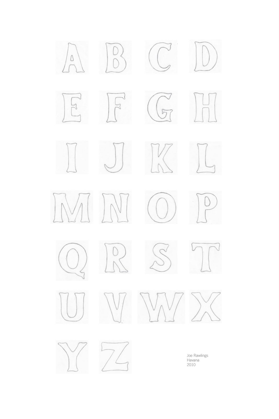
My font is based on Havana Cuba; super obvious.

I was inspired by cigar packaging and baseball uniforms.

I wanted it to be chunky and reminiscent of the early half of the 1900's when Havana was in its Prime.

As I was doing research on Havana I found out that it was the place to be. There were more theaters, casinos, and live entertainment then New York back in the day. The zoo in Havana was also a main attraction. After the whole political thing went down in Cuba, Havana pretty much fell apart. Many Cuban's were struggling to put food on the table. To poke fun at the situation a local changed some of the signs in the zoo from "don't feed the animals" to "don't eat the animals."

My designer is Si Scott, who does these really elaborate and intricate typographic posters with a lot of line weight variation. I thought that it might be interesting to try and capture some of the variation in line weight with the different shadows and how they contrast the bold weight of the cutout design itself. Not quite there yet. Any thoughts would be great.

Type poster and alphabet


My alphabet is based on Johnny Appleseed.
I wanted it to look twiggy and sort of wild the way branches are.
My inspiration for my poster is based on Colin Lee's Dulce & Gabana. I wanted to include some flourishes, but not so many that it becomes overwhelming.


SOUTHERN BELLE & Sumeco:

Hand-drawn typeface: Southern Belle
And here's my poster. What do you think?

Isabella & Linzie Hunter


OK so here is my poster and my typeface... This was a really interesting project for me because with my font I had a completely different idea and style in my head before I had to use the aesthetics of the artist Linzie Hunter. She has a really kind of sketchy/cut-out feel to her work so that is what I was trying to do with the poster. She creates a lot of interest in her work by using a lot of contrasting colors and so that is what I was trying to do in my piece with the more warm colored shapes of some of the background type areas. There are a few things that I have already noticed that needs a little bit of work before I get the poster printed but hopefully you can give me some good feedback also. Oh I haven't finished getting my type vectorized but I'll try and get it done by tonight. Hey thanks guys and I hope you enjoy!

derrick williams (yulia brodskaya)

Well here are my sketches and this is what i worked with.....i would like critique on color becuase i would like to add color but i do not know what i should make it....any suggestions would be great
and the second to the last was done by yulia brodskaya and the very last one is my own with the word given to me.


Sheboygan baby!


So Sheboygan, if you forgot is an old harbor fishing town on the coast of Wisconsin. This is what I have as of now. It is suppose to look like water text is dripping down the side of an old rusty wooden boat covered in barnacles. Any tips are very appreciated for whats working or not.

Lumberjack

Here's my inspiration from Nate Williams

His illustrations are very flat and he also uses background textures, so I did a combination of them!

Here's my poster: I tried to make the lumberjack flat, and make the hand drawn text be the tree.

...and now here is my FINAL poster with the revisions :


Here's my font Lumberjack font:


Honky Tonk

here are the fruits of my labors so far.

alphabet:


poster:


i like my alphabet, i think it is working well for the concept.

i am not sold on the poster... remember how i suck at photoshop?
yeah i think i should stick to actually making things.
i am leaning heavily towards using my wood burning pen like i originally planned.

i am not sure where to take it from here. feedback and suggestions would be helpful.